
Mobile and web platforms icon

Funds-In payment methods

New Interstitial page design and educational content update

UX Case Study — Shivraj Singh
Role: UX lead Research Visual Design Usability Testing
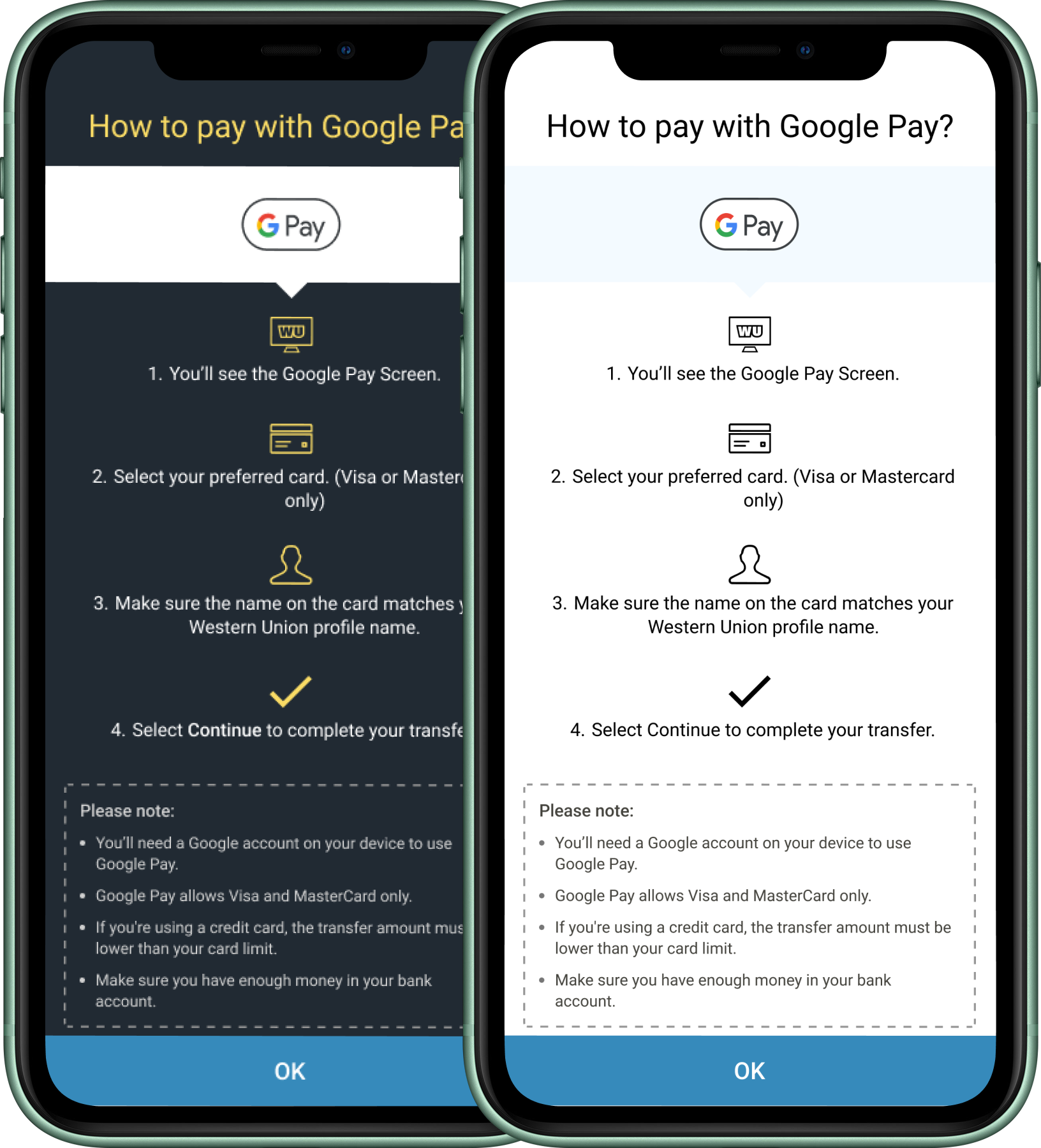
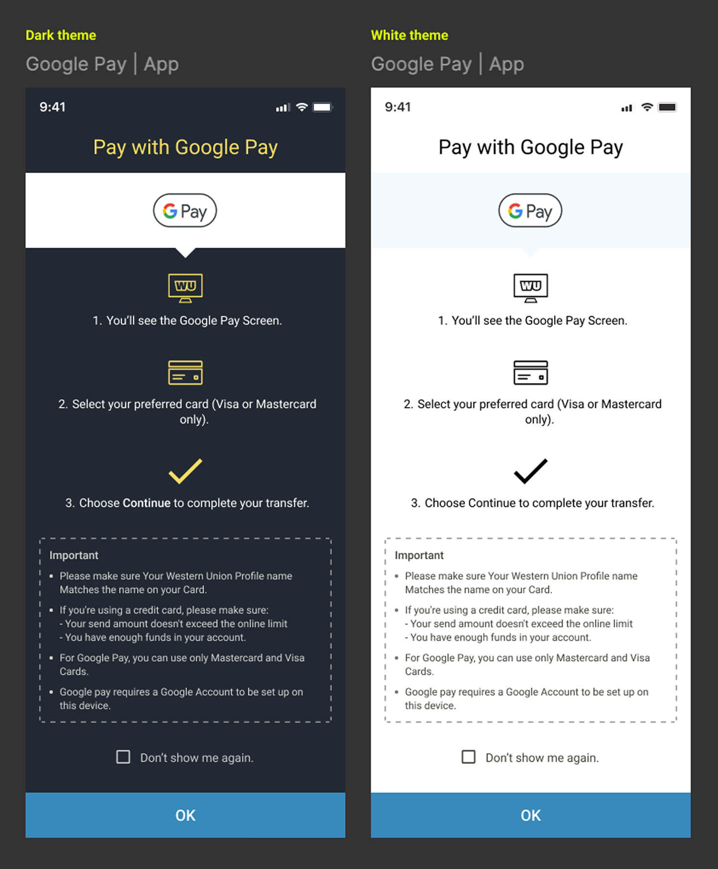
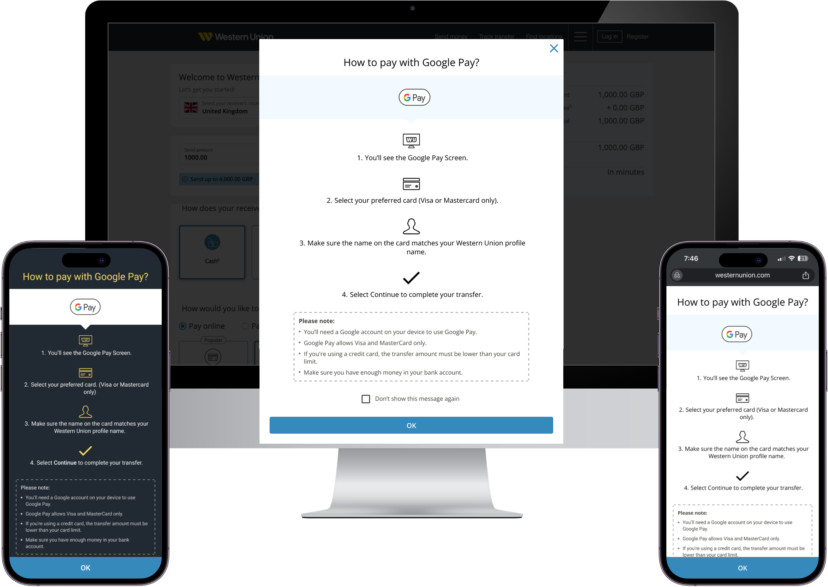
Google Pay funds-in instruction screens, dark and light theme

About This Project

Align all funds in educational interstitial page design consistent for all countries and platforms.

When customer lands on SMO journey showed educational content for funds inconsistently across countries and platforms, with some markets still using outdated information since the launch. I standardized the interstitial design and refreshed content to create a clear, consistent, and unified experience for all customers.

Markets: US, GB, UK, France, Germany, Italy, US, Mexico & etc.

Product Overview

Western Union is a global leader in cross-border, cross-currency money transfer services. Through its digital channels, Western Union helps people and businesses move money to more than 500,000 agent locations in over 200 countries and territories, and in more than 130+ currencies.

46M
Digital customers globally
100M+
Total customers
55M+
Mobile app download
4.7M+
Digital transactions per month
56M+
Digital transactions annually

Problem

Inconsistent interstitial designs and outdated educational content across R3 markets created a fragmented experience for users selecting funding methods.

  • Multiple funding methods shown on the SMO page (Google Pay, Trustly, Klarna, Faster Payments, iDEAL).
  • Interstitial pages appeared in different formats (full page vs. pop-up).
  • Design inconsistencies across R3 countries and platforms.
  • Some educational content outdated since initial launch.
  • Created confusion and lack of clarity during payment method selection.
VS lightning bolt divider

Solution

Standardized the interstitial design and refreshed localized content to create a consistent, user-friendly experience across all R3 markets.

  • Designed a unified interstitial experience for web and app.
  • Conducted user testing to validate the new design.
  • Implemented consistent UI patterns across R3 countries.
  • Updated and localized educational content in multiple languages.
  • Improved clarity and usability when choosing funding methods.

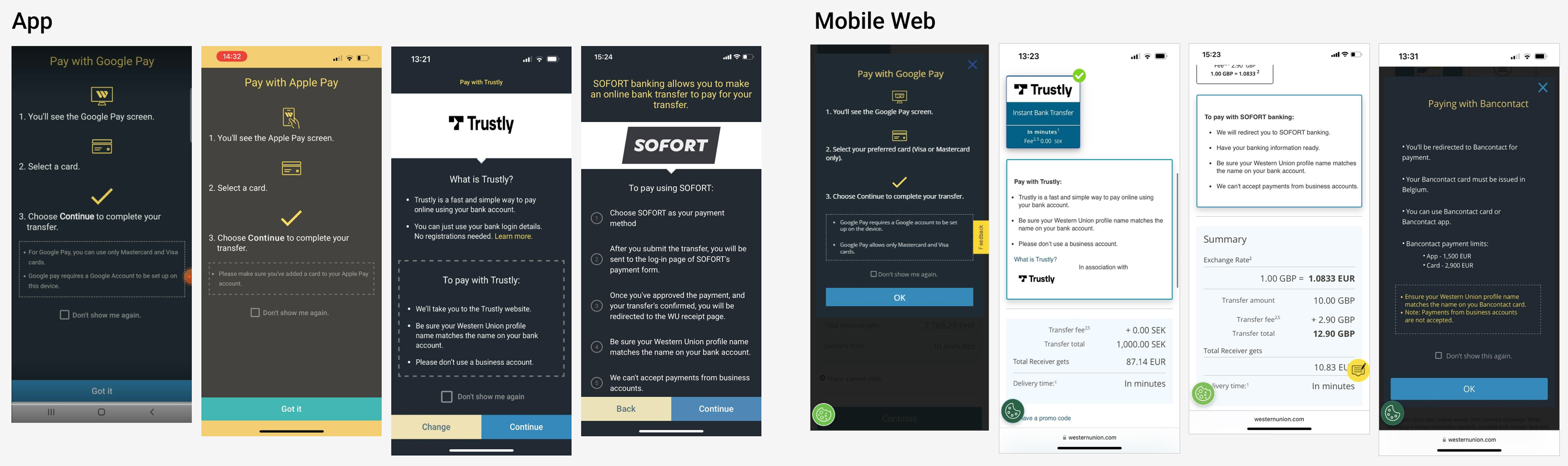
Old design (Inconsistent interstitial pages and outdated educational content )

Old interstitial designs across app and mobile web: Google Pay, Apple Pay, Trustly, SOFORT, Bancontact

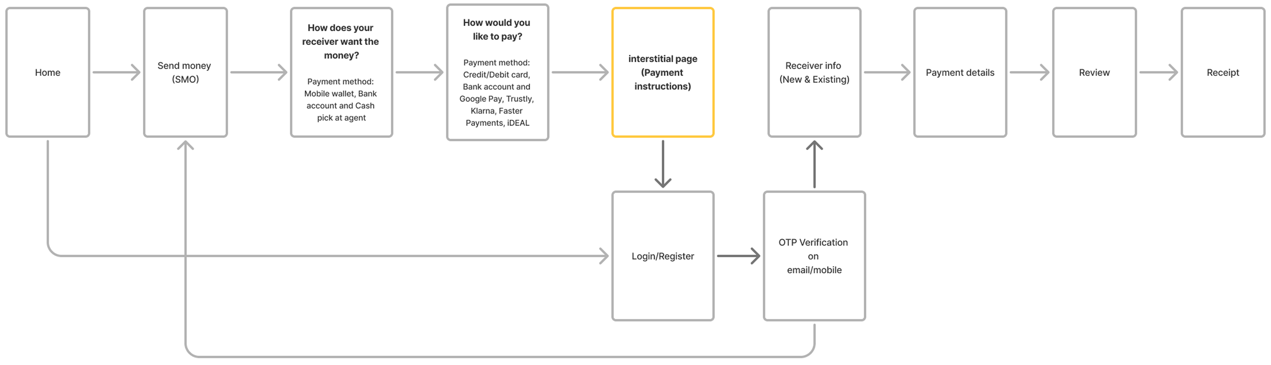
User Journey

User journey flowchart from Home through payment method selection, interstitial payment instructions page, login/OTP verification, to receipt

Research Objectives

When users land on Western Union app fund-in page, it shows square tiles of payment methods that are available to fund the money transfer. The educational information shown for each fund-in method is outdated and is not standardized. This results in a visually inconsistent and a potentially confusing user experience.

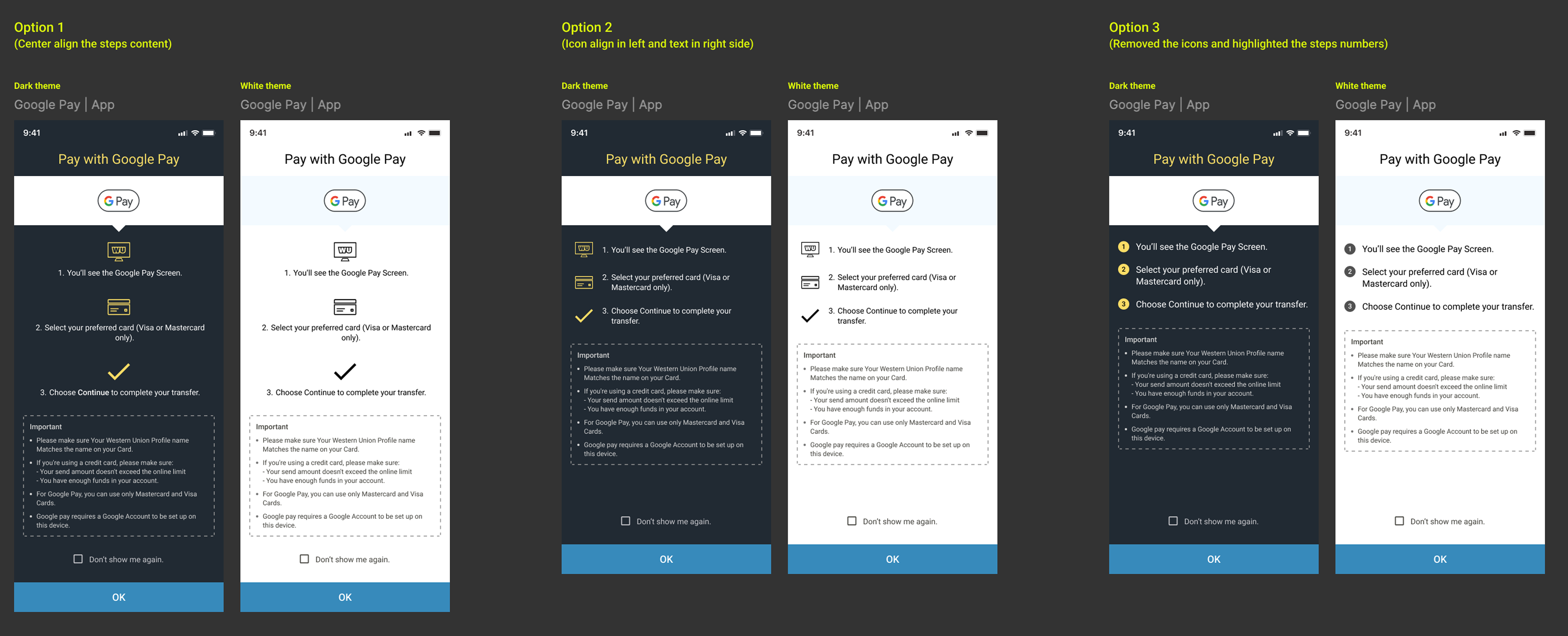
The design team have produced 3 designs options for funding transaction via G-Pay as an example.

The objective of this research is to determine which of the 3 designs users like most and why.

Methodology Overview

Market: UK, France, Germany, Italy
Participants: Western Union existing users
No. of users: 123, Online survey
User types: (N = number of users)
Demographics
- Female: N=58
- Male: N=65
Age groups
18 - 34: N=47
35 - 54: N=67
55+: N=9
Research illustration

Interface Variations Tested

Three design variations were tested to evaluate how different instruction layouts, visual cues, and themes influence user understanding and task completion when paying with Google Pay, Trustly, Klarna, Faster Payments, iDEAL and etc.

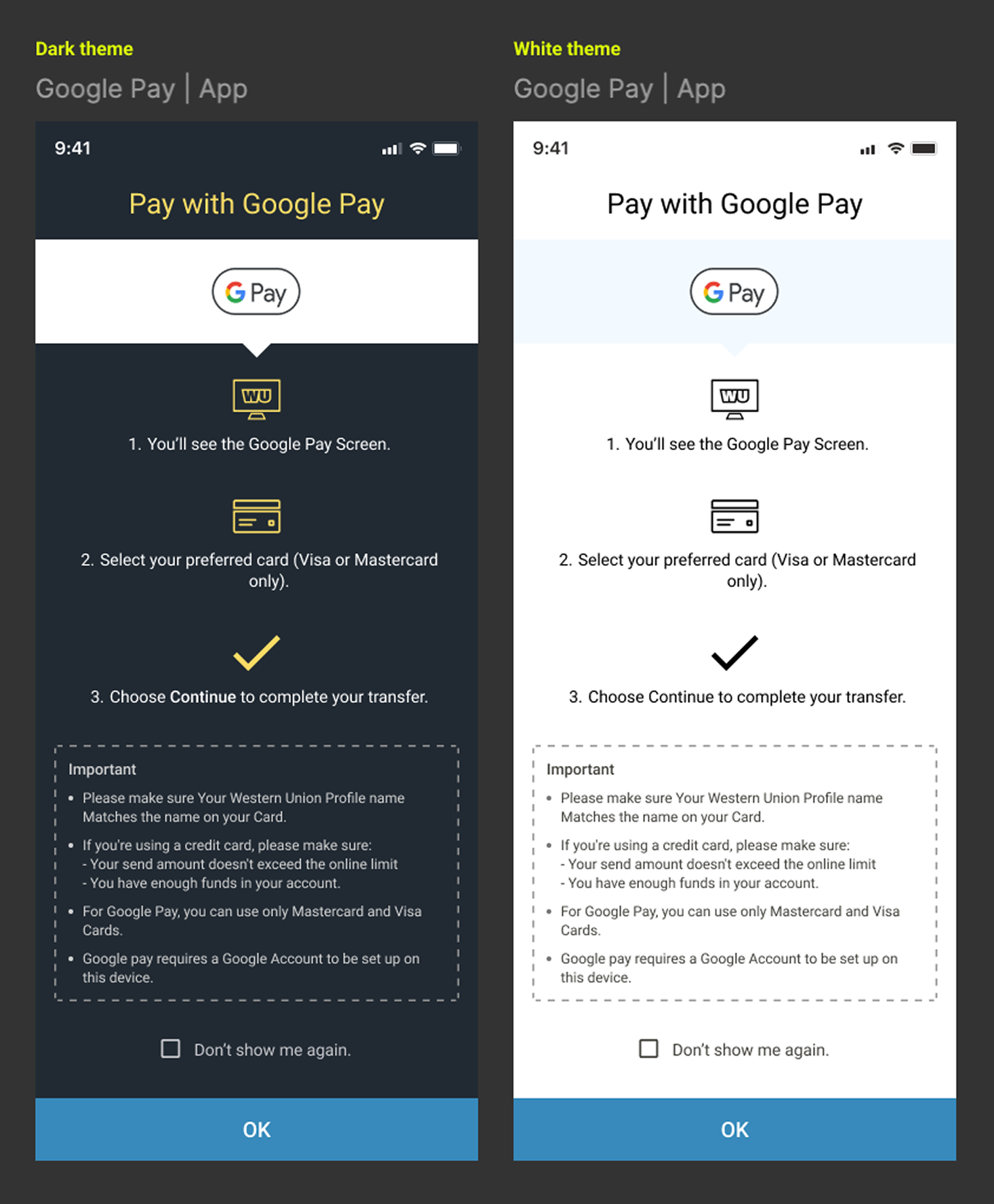
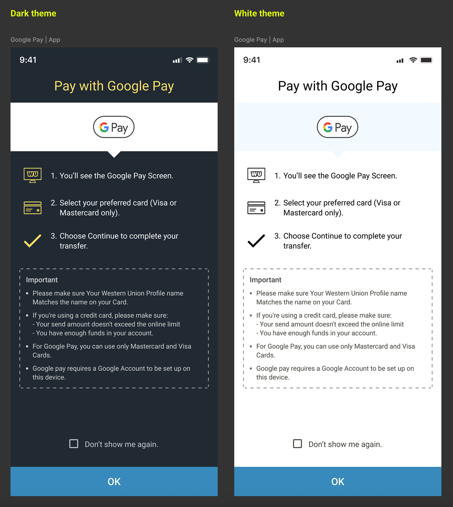
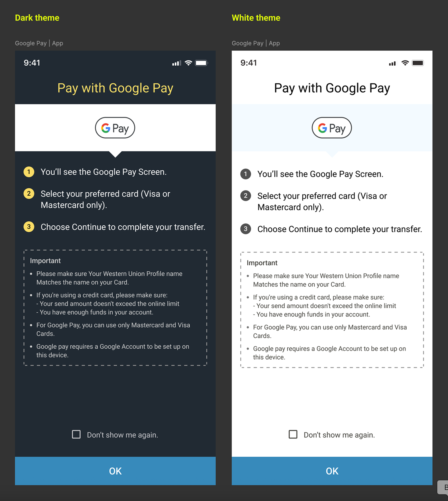
Option 1, 2 and 3 interface variations, dark and white theme

Key Research Insights:

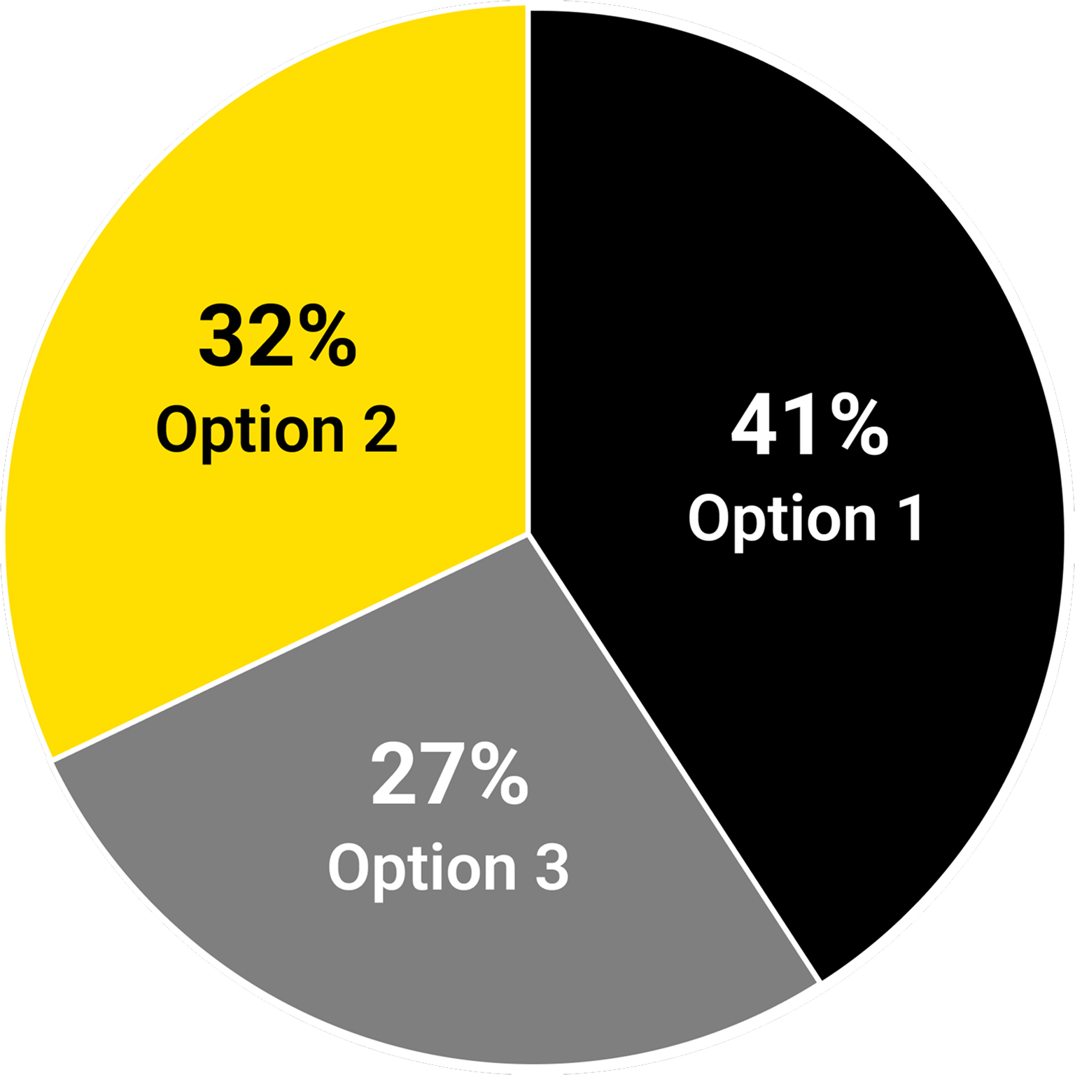
In a head-to-head evaluation, design option 1 is the winner

Consumers appreciate its clarity, user friendly and intuitive layout and visual appeal Consequently, they feel the instructions are clear and easy to understand. Further, this design is seen as modern, simple, and is effective in conveying information clearly and intuitively.

Design option 2 is also well received by consumers and is rated similar to design Option 1 on all individual KPIs. It is seen as clear, concise, and visually appealing. However, some consumers felt that layout is cluttered, making it difficult to read the information.

Option 1 interface, dark and white theme

Head-to-head evaluation

Consumers prefer Option 1 over the other options because of its clarity, user-friendly, and visual appeal. Consumers appreciate the layout, spacing, and use of icons, which contribute to an easier understanding of the instructions. The design is seen as modern, simple, and effective in conveying information clearly and intuitively

Pie chart: 41% Option 1, 32% Option 2, 27% Option 3

Why?

Option 1
  • Think it's the design that "breathes" best and thus, makes the information clearer and more accessible.
  • The icon above the instructions makes it look so easy to use, it less confusing than the other ones.
Option 2
  • Users prefer the design because the images and descriptions are well section beside each other for more clarity.
  • Clear illustration with pictures and properly itemized for easy flow of information.
Option 3
  • Users like that it's more compact, there are no icons and it makes it easier for me to follow somehow.
  • Users prefer the design because it is simple to use and very easy to understand and the elements are well arranged.

User reactions: Option 1

+The initial reactions were mostly positive, with consumers appreciating the clarity of instructions, user friendly and intuitive layout and the visual appeal of this option:

  • The design is very aesthetically pleasing, divided by labeled diagrams and arranged vertically, making it easier to read and understand.
  • Users like the explanations step by step. It's very easy to understand with these explanations. Like these screens because it's clear and easy to understand.
  • It is very easy and intuitive layout. It is easy on the eyes and very appealing and impressive..

Some suggested simplifying the layout for better visual appeal:

  • There's too much on the screen and the icons above the text feel out of place.
  • The spacing is too big for this design.
Option 1 dark and white theme mockups

User reactions: Option 2

+Members responded well, praising the clear, concise, and visually appealing messaging:

  • It's perfect, text takes up less screen space with icons on the same line. Visually, it's clear, compact and easy to follow.
  • It is a very dynamic screen with clear and objective information that manages to convey its main message. Users like the simple form and informal language, being descriptive and objective.
  • Initial impressions of these is users like how clear the useful information is detailed in how to use Google pay.

A few felt it the layout is cluttered, making it difficult to read the information:

  • So much text made it difficult to read and understand. logo are bit big and on the left side, personally didn't liked the design.
  • Users don't like the Field of the text "Important note", this text field is not easy to read, and it makes looking the using difficult. It would be better, that I see the "note" field only if I take step forward to choose it.
Option 2 dark and white theme mockups

User reactions: Option 3

+Many praised this option for its clear, straight forward instructions and modern design:

  • Extremely clear and easy to follow. Users like the clarity in have the three separate points listed, as well as the important notes listed below.
  • It is simple and easy to understand. It is informative and easy on eyes.
  • Users like this a lot more. The layout seems clearer although information is basically the same. It makes feel more at ease using this because it's less overwhelming.

While others saw room for design improvements related to aesthetics and layout:

  • No logos in it made it difficult to understand the text. Too much text made it difficult to read and comprehend the content.
  • For some users its looks too simple and lacks a creative touch. This format does not befit a prestigious company like western union..
  • The fact that there is not a lot of space between instruction make look hard, and make it look like the instruction are hard.
Option 3 dark and white theme mockups

Metrics comparison

Options 1 and 2 are perceived to be more visually appealing than option 3.

84%
85%
77%
Clear Instructions
83%
85%
73%
Easy to understand how to use
83%
83%
71%
Layout appeal
77%
80%
70%
Design appeal
77%
76%
70%
Design - appropriate for Western Union
84%
85%
71%
Feel confident using this payment method
Option 1 Option 2 Option 3

Final design solution

Final design solution across web and mobile, with link to the final Figma design

Business Impact / Metrics

  • +11% increase in payment method conversion
  • 24% reduction in payment-method confusion
  • 18% improvement in task completion
  • 32% faster transaction completion time
  • +9% increase in returning users

Thanks for watching